Eaton Socon Preschool Public Consultation

On the 6th November 2014, Devlin Architects undertook a public consultation for the pre-school.  The aim of this was to gain an understanding of how parents, the general public and local neighbours viewed the proposed design prior to submission for planning.  We provided a set of display boards showing the process and final design.  In addition, our architect, Simon, gave a presentation to those who attended, to talk them through how the scheme developed from initial studies to the current designs. The feedback gained was extremely positive and very supportive with compliments on the design, the school’s ambitions and its facilities.

On the night there were several questions raised by the public.  They ranged from queries on the cladding, to the size and scale of the buildings.  We answered these questions individually and each person appeared satisfied with the response.  In addition, those neighbours directly affected by the new building’s location were given one on one consultations with Simon to ensure they understood the design, the reasons for the position, the mass of the building and the proposed external materials. Each resident was listened to and their comments and issues were taken on board.  The positive outcome of the public consultation will  be reflected in the final documentation that is due to be submitted for planning permission.

For more information on this project, see https://new.devlinarchitects.com/projects/eaton-socon-pre-school/

Eaton Socon Pre-School unveils plans for its new building

From Cambridge News:

Eaton Socon Pre-School has unveiled its plans for a new £500,000 building to replace its current home.

The pre-school has already managed to put around £300,000 in place but still needs to find the remainder of the money.

It has just held a public consultation over the new building, including presentations from its architect.

The new building will replace the two portable buildings it has used in Queens Gardens for years and which are becoming dilapidated.

Nick Walker, chairman of the management committee, said: “The school has been there nearly 30 years. It has grown and we need to replace the buildings so we can increase the capacity we can take.”

He said the project would cost £500,000 but £200,000 was still outstanding: “It is getting there but obviously the present economic climate doesn’t help.”

The building is a wooden semi-permanent structure which would be able to hold 100 children, double the present number.

The pre-school is a registered charity and provides care and education for children aged from two to four, with one to one care for children with disabilities or life-limiting conditions.

It has been rated as outstanding by Ofsted and acts as a feeder for local schools.

For more information on this project, see https://new.devlinarchitects.com/projects/eaton-socon-pre-school/

Architects Journal 2013 – Writing Prize

I recently entered the AJ Writing Prize 2013 and this was the submitted piece. I went with a topic I had previously undertaken as a lecture for the Liverpool Architectural Society for the travel scholarship award. However, this time it needed to be more concise! If you have any comments or queries of the contents then please leave a comment. I have added images into the text to break up the content into smaller chunks and form an overall article.

Humour in Architecture

Portrayed in films and media as stressed, serious characters, always carrying rolls of drawings and sometimes even being involved in disasters; obviously due to excessive workloads or losing the coffee!  We are workaholics tied to our ‘babies’, focused heavily on creative responses to sites or clients. Architects and the industry as a whole are perceived as serious and conscientious professionals who lack a sense of humour. Really!  Why do we suppose there is a perception of no humour? Surely not all the time!

Keanu Reeves 'The Lake House' - Architect under pressure.

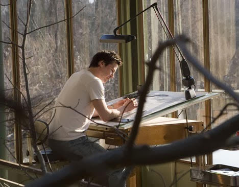
Keanu Reeves ‘The Lake House’ – Architect under pressure.

Humour; or the act of being funny; requires creativity, observation, timing and delivery – all of the skills and attributes Architects should possess.  Far be it from me to suggest we hit the comedy clubs in our ‘spare time’, but let’s dispel the myth shall we.  We influence the positive well-being of people and should relay a more jovial dimension to our work.

Our main source of humour or wit comes from a stalwart of architectural press who has seen, heard and depicted it all in the form of sarcastic and lampooning cartoons, Louis Hellman. These caricatures show the mood and character of the individuals (politicians, architects or celebs!), the buildings, or the issues being debated in a simple charismatic manner.

Copyright Louis Hellman - recent Vinoly skit!

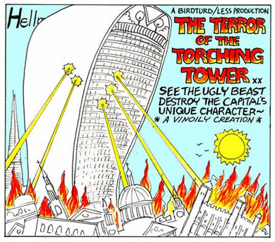
Copyright Louis Hellman – recent Vinoly skit!

This alters the perception of the story for the reader acting as a visual guide in one descriptive shot. Expressing what we all feel and giving us a chance of a wry smile or gasp in delight. All of those featured within these publications seem to take it in good spirit and some put them on display in exhibitions in admiration.

Architecture is one of the most expressive art forms enveloping everyone from a user to a passer by, changing appearance from when it is physically engaged with up close, to when the buildings are published in the press.

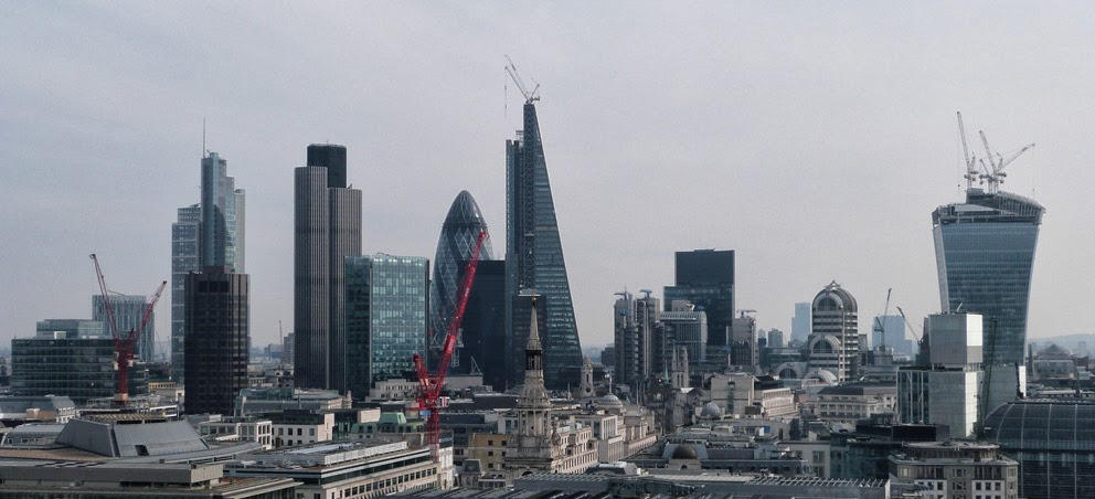
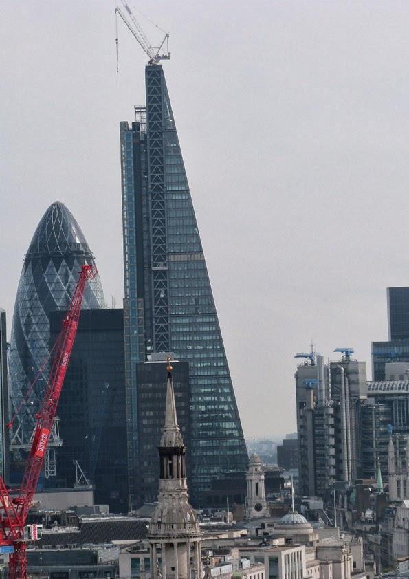
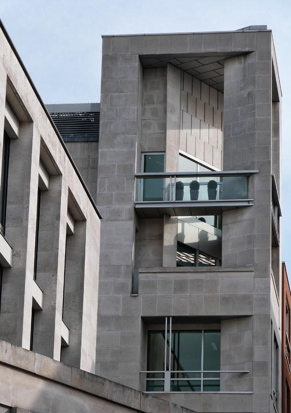
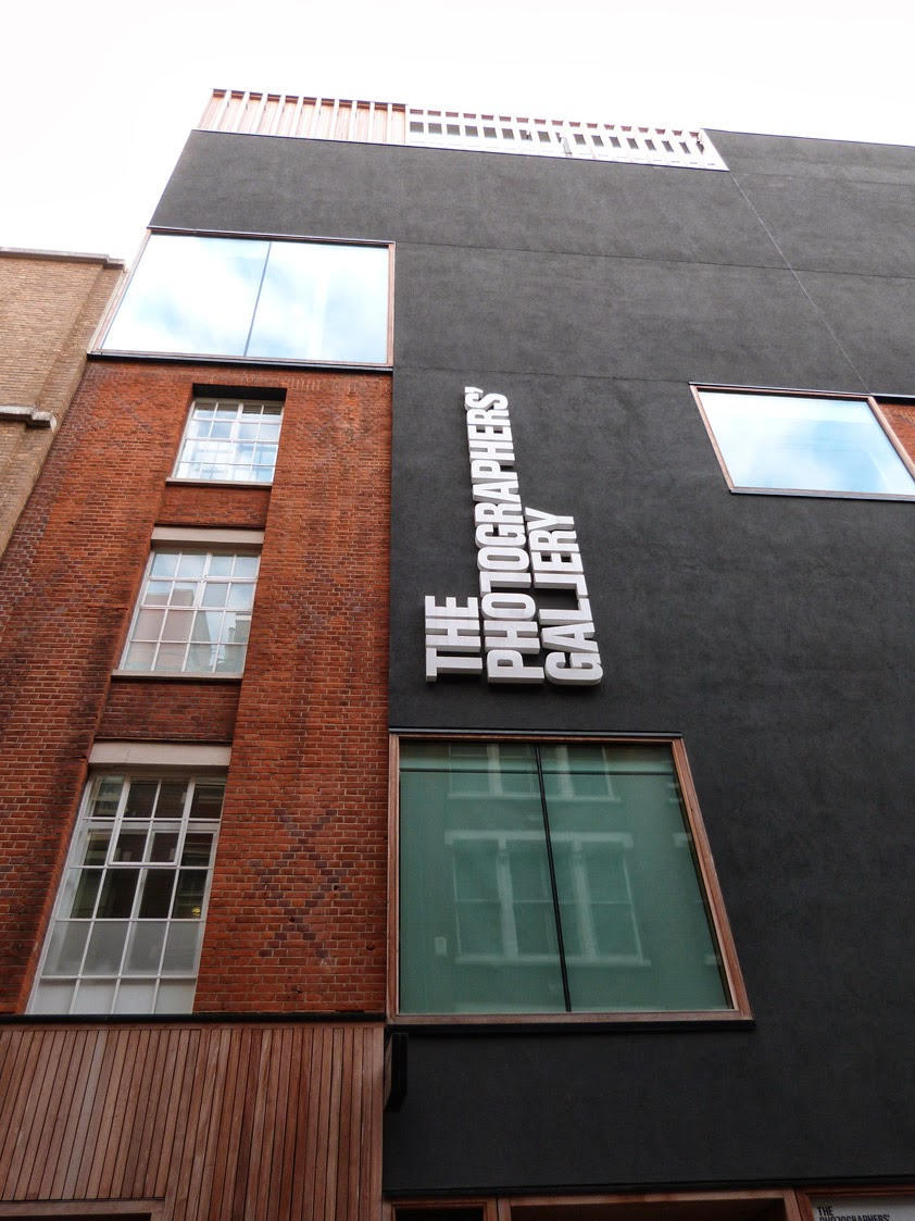
When Norman Foster designed 30 St Mary Axe building with guile and gusto to trump previous skyscraper forms; he wouldn’t have imagined when putting pen to trace the nickname the ‘Gherkin’ would occur. A hairy, ugly and phallic shaped pickle that most people detest was given to this modern sleek engineered and distinctive marker on the London skyline.

30 St Mary Axe (central) and 20 Fenchurch St (Right) - the new london skyline!

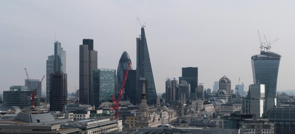
30 St Mary Axe (central) and 20 Fenchurch St (Right) – the new london skyline!

However affectionate and appropriate the tone of the nickname, it has stuck and regularly been used in the press, the marketing and the public at large. It was given in good humour and fortunately it has been taken as such. Similarly, the ‘walkie talkie’ (or ‘walke scorchie’ recently) tower by Rafael Viñoly (20 Fenchurch Street), or the Rogers Stirk & Harbour building the ‘cheese-grater’ (122 Leadenhall Street) both of which have been associated since planning from the architectural critics and public alike.

122 Leadenhall St 'Cheesegrater' - Rogers Stirk & Harbour.

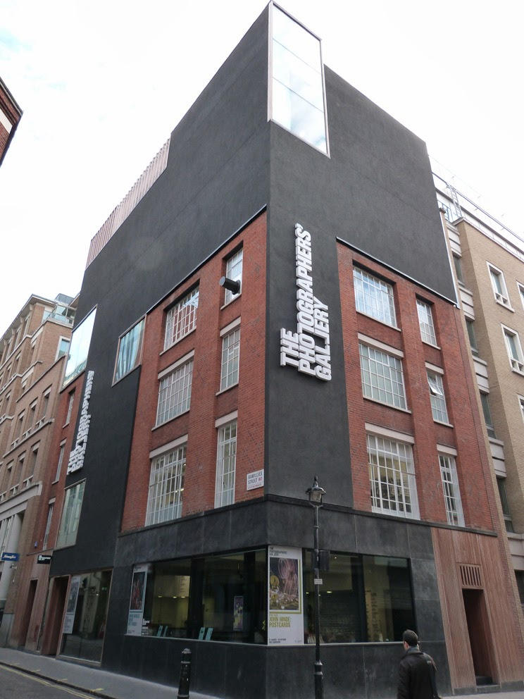
122 Leadenhall St ‘Cheesegrater’ – Rogers Stirk & Harbour.

In one case – the yellow structure to the rear of the grater is the cheese block; sharing an architectural joke and a lighter more humorous side to RSH, displaying a willingness to maintain the usage of bold colours on schemes and for expressing structure regardless of any negative perception.

Architecture sometimes drifts over the line into mockery, buildings constructed in comical forms from a picnic basket (Longaberger Basket Co) to a row of books (Kansas City Library). They are shaped as designs reflecting human life to try and engage with the public, but create amusing structures rather than admirable architecture.

Kansas City Library, Missouri - Bob Holloway - As a fun addition to the streetscape.

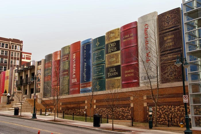
Kansas City Library, Missouri – Bob Holloway – As a fun addition to the streetscape.

Longaberger Basket Company, Newark, Ohio - NBBJ - Mimetic architecture at a large scale.

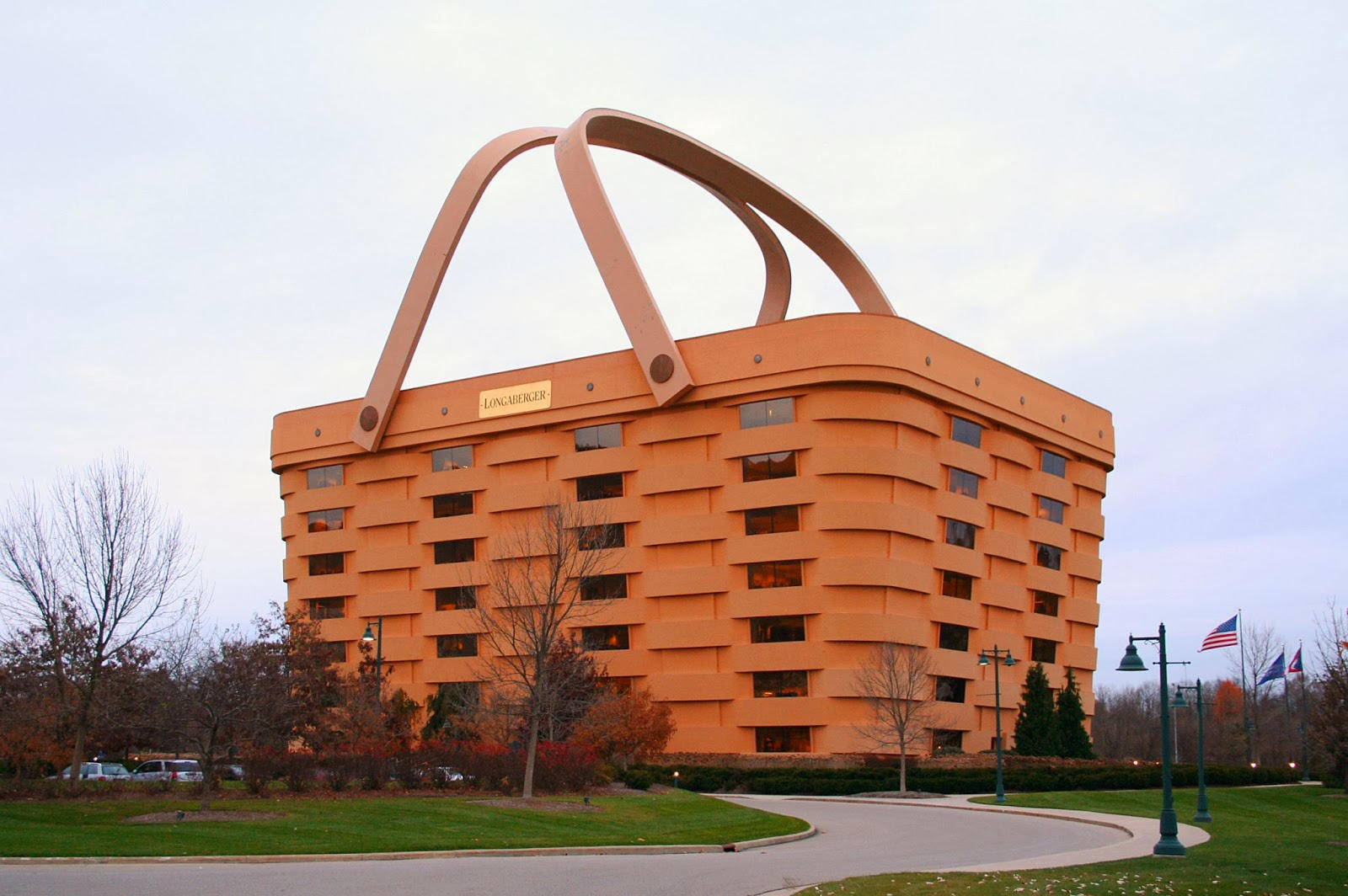
Longaberger Basket Company, Newark, Ohio – NBBJ – Mimetic architecture at a large scale.

Sometimes this desire is for a reason; both are constructed purely to use them as an advertisement for the company. Arguably, the VitraHaus at Vitra museum by Herzog & De Meuron could be under the same bracket, advertising their furniture (residential) using a simple form (house) in a distinctive and slick manner. This has formed a physical representation of humour in my opinion, not a one-liner joke.

Vitrahaus - Herzog & De Meuron - simple form to create a lasting positive reaction.

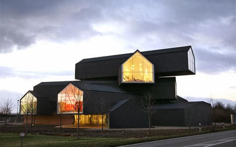
Vitrahaus – Herzog & De Meuron – simple form to create a lasting positive reaction.

H&DM have created several buildings that could fall into the ‘marmite’ category. Barcelona’s Forum, the ‘Blue Cheese’ building is situated on the seafront at the end of the promenade. The structure uses commonplace materials inventively to create an intelligent, engaging building that provides external gathering spaces in and around. People taking ‘selfies’ within the stainless steel, mirrored, conical roof lights, or running hands over the roughly textured, blue-sprayed concrete surfaces, all allow a personal interaction and frivolity.

 Barcelona Forum Building - Herzog & De Meuron - established on the fabric of the city.

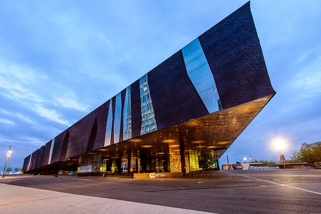
Barcelona Forum Building – Herzog & De Meuron – established on the fabric of the city.

Similarly, consider the Walker Art Centre in Minnesota.  Its faceted aluminium panelling is modelled on crushed tin foil, with openings forming a grimacing face in the style of computer graphics of the 1980’s. This shimmering cantilevered box is the destination point of the building, containing the theatre and events spaces.  The new expressive element shifts the focus away from the dull and austere Barnes building in brick. Coupled with a new, low-lying glass link; showing movement around the museum as a live advert for passers-by, structures that change the overall depiction and positivity of the museum.

Walker Art Centre, Minneapolis - Herzog & De Meuron - expressive intervention.

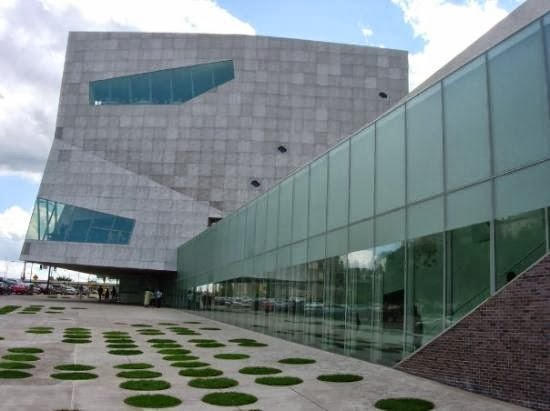
Walker Art Centre, Minneapolis – Herzog & De Meuron – expressive intervention.

Public interaction is essential within architecture as shown by SITE Architect’s ‘Best Products’ retail outlets when experimenting with form and materiality on mundane industrial units in the 1970’s. A balance is found between literal statements and their whimsical ideas. The peeling away of the facades, the tumbling of brickwork cladding or the tilting up of the building façade, all showed a bold approach to drab typology. The structures presented a light-heartedness yet mischievousness, and to some comical response.

BEST supermarket unit - SITE Architects - broken down and exposed.

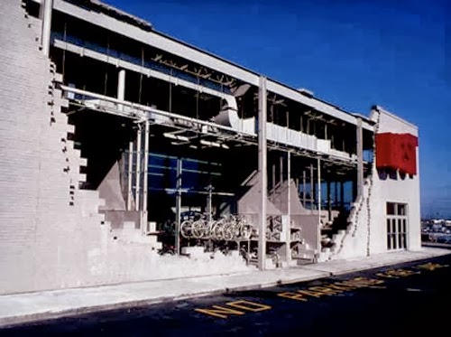
BEST supermarket unit – SITE Architects – broken down and exposed.

Observation is critical to an architects skill set, knowing how to transfer ideas to the ‘audience’, city or the individual; showing them how they live or work and how they could in the future. Setting trends and asking questions whilst smoothly taking the user(s) on a journey. The Birmingham public may be taken ‘to infinity and beyond’ as suggested in the press, with the new library by Mecanoo being compared with something from Star Trek.  The critique being influenced by the ‘alien blob’ (Selfridges by Future Systems) but it will be accepted and enjoyed long-term.

New Birmingham Library - Mecanoo - expressive facade replicating the jewellery quarter.

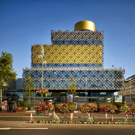
New Birmingham Library – Mecanoo – expressive facade replicating the jewellery quarter.

Architecture will continue to push boundaries of taste and public perception, changing the serious tone to one of creativity and originality; we need to show our humorous side, leading to a more positive response which leaves people demanding an encore!

Recent London Visit

On a recent trip to London I experienced and walked past some creative architecture new and old, even very old! I thought I would share a few of the photographs that were taken.


Devlin Architects Office

I have updated the website to include the Devlin Architects Office sketches. Ongoing process of development with a future build to provide me with space to expand the business!

Let me know your thoughts and keep on checking as further sketches will be uploaded.

2013 could be a busy year with a few more things possibly on the horizon….who knows!

Website & things!

Just to let you all know the website is now back up and running – more images and info to be uploaded soon…..oh an a few other bits!

Keep on checking it out! Future website design to come!!

Also, recently submitted an entry for the AJ Writing Prize 2013 and once I know either way (probably not really!) I will publish the entry on the blog. We shall see. Gotta be in it to win it!

Office Design…..Initial

I have been looking at the design of the office after inspiration from ‘Amazing Spaces‘ programme by Channel 4.

It’s a starting point:

01 Axo-sketch-flat

The initial idea uses the set planning guidelines for small spaces that do not require planning permission. Slightly larger than a garden shed this will allow for max 2-3 people to work at a squeeze or 1 person comfortably. The materials are influenced by the white timber cladding on neighbouring house facades, except it will also be used on the roof and joinery.

I will be developing this further so watch this space!

Website changes…

A few changes to the website made today, let me know what you think.

As promised I have uploaded the images and boards that formed my competition entry for the revival of a silo competition.

More schemes to follow!

Revival of a silo competition entry

Recently (i say recently – Feb 2013) I found out the result of a competition I entered. Unfortunately, I was not shortlisted but I feel the process was a useful exercise to complete and enjoyed formulating my design.

SUBMISSION

As the blogs have stated I entered the ‘Revival of a Silo’ competition at the beginning of the year organised by Homemade Dessert. See website: http://homemadedessert.org/

The masterplan was based around re-using the existing silo and buildings in the least obtrusive fashion and retaining the character of these industrial forms. The two existing entrance buildings would be adapted by changing the internal spaces, the roofscapes and adding small scale extensions.

As you enter the site you walk down the central promenade towards the central silo and the new entertainment space with ‘globe’ esque theatre within the thick concrete walls. On the North side of the promenade is the dance school with two expressed studios and the re-use of one existing building to form additional studio and office space. The use of brick slip rainscreen roofs to match the existing brick exterior form monolithic structures with expressive internal spaces.

Behind the dance school along the north boundary are a series of ‘jewel’ like workshops for the more industrious art forms and could offer a point of trade for the site when they open up.

To the south of the promenade I have used the existing brick column structure as an interpretation space. A meandering art gallery of tall spaces formed from slender trunks of brick and concrete, which support the raised garden space.

In each of the southern most corners I have located eateries that enable the passing trade to engage with the site. The south east corner cafe is located within the garden space and is set within the trees. The south west corner bar breaks open the existing surrounding brick wall and forms a new frontage to the road elevation.

The existing silo is retained and extended vertically as a series of ‘cogs’ that incorporate art studios and recording studios around a central core. This element becomes a marker for the surrounding art district and offer inspiring views across the river in front of the site.

Here are a couple of images of the submitted scheme. For the rest of the submission and all the sketches completed, please visit https://new.devlinarchitects.com – I will be uploading my submitted boards very soon!

Upper level plan - basic outline Aerial view from South-west corner Aerial view from North-east corner Ground Plan - Basic outline

To see the winning entries log onto Homemade Dessert website – Congratulations to the teams that won! Some interesting designs and shows restraint pays dividends!